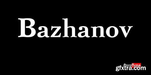
PT Bazhanov™ was designed at Polygraphmash type design bureau in 1961 by Michael Rovensky (1902-1996). Based on the lettering by Moscow book designer Dmitry Bazhanov (1902-1945). Old-fashioned flavor of this design recreates the Soviet hand-lettering style of the 1940s. For use in title and display typography. The digital version was developed for ParaType in 2001 by Lyubov Kuznetsova.
OTF | 3 Fonts | JPEG Preview | 1 Mb RAR
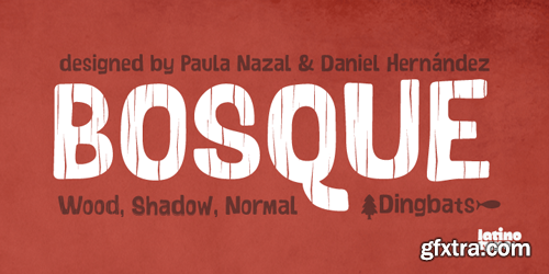
Bosque is a typeface designed by Paula Nazal and Daniel Hernandez. It belongs to handmade style, it’s rough and raw with soft edges. It has 6 variants: Normal, Wood, Shadow, Wood Shadow, Dingbats y Shadow One, this gives great versatility. It possess a wide set of characters, ligatures and some alternates.
OTF | 6 Fonts | JPEG Preview | 1.9 Mb RAR


Educator - Computer Science: WordPress
English | 8 h 50 min | .mp4 | H.264 980x660 | AAC mono 48 kbps | 899 MB
Genre: eLearning
Jim Hague helps you utilize WordPress to create spectacular websites without having to worry about coding. Jim has over 15+ years experience designing websites, developing media products, and creating dozens of WordPress sites.
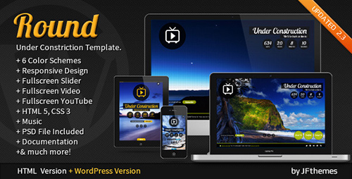
Round is a unique, clean, Responsive, Fullscreen Countdown / Coming Soon / Under Construction / Awaiting one page mini site Template in a minimalist style. Menu with animation effect. High-Resolution Retina Display Ready.
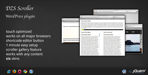
Tired of the default scrollbar ? DZS Scroller WordPress pluginis the ultimate scrollbar for your site which you can customize very easily via CSS if the 6 skins included are not enough. It also comes with enhanced functionality like scroll by hover or fade on mouse leave. And it works on iPhone/iPad! So what are you waiting for ? Get it today for your site, integrate in less then 5 minutes!

This plugin adds Media gallery capability to user profiles. Users can now create more lively profiles by adding pictures, videos and audio files to their profile. Images can be opened in a lightbox. Pagination for media files is available.
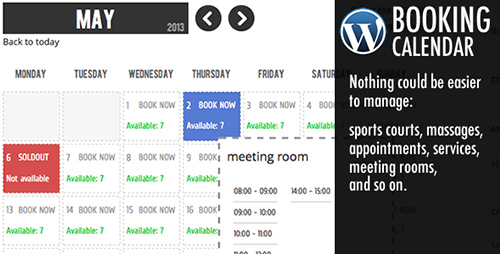
Booking Calendar helps you to easily add to your own wordpress website a powerful and simple booking system to in a few minutes.
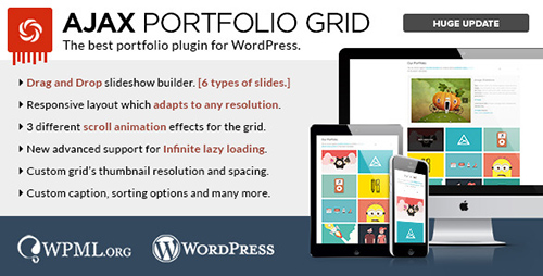
Ajax Portfolio Grid for WordPress is a sleek and minimal plugin packed full of awesome features. The plugin puts your work first, keeping the design elements to a minimum while still maintaining a definitive modern style.

SkillFeed - Mastering Dreamweaver v. CS5 Made Easy Training Tutorial
English | .FLV | aac, 44100 Hz, stereo | h264, yuv420p, 720x540, 3.00 fps(r) | 330MB
Genre: E-learning
Mastering Dreamweaver Made Easy features 130 video lessons with over 6 hours of introductory through advanced instruction. Reinforce your learning with the text of our two printable classroom instruction manuals (Introductory and Advanced), additional images and practice exercises. You will learn how to create a website from scratch, while exploring all of the techniques to add the various elements of a website – text, links, images, CSS and much more.
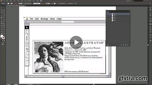
SkillFeed - Learn Adobe Illustrator from Scratch
English | .FLV | aac, 44100 Hz, stereo | h264, yuv420p, 860x540, 15.00 fps(r) | 1.31GB
Genre: E-learning
Give wings to your creativity with our comprehensive and unique course on Adobe Illustrator. Learn with this course to create amazing graphics for Web, Video and Film. In this course of over 10 hours you will learn expert tips and tricks and will learn to do advance design and graphics work. You will start with basic Illustrator techniques and will progress on to topics such as Pen Tool, Transforming, Gradient, Types & Panels, Design, Perspective and Automation.

Concord Font Family $350
7 OTF & TTF Fonts | Designer: Aakash Soneri
Yet another typeface with simplicity as its core element. Concord is derived from a successful type family ‘Accord Alternate’ with an added geometric touch. Concord is a geometric sans serif. It has large counters which enhance readability. It is available in seven different weights for emphasis.
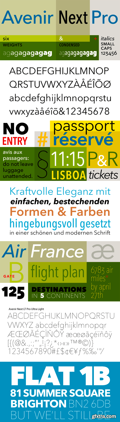
In 2004, Frutiger, together with Linotype in-house type designer Akira Kobayashi, reworked the Avenir family to address on-screen display issues. The result was titled Avenir Next. The typeface family was increased to 24 fonts: 6 weights, each with a roman and italic version, in 2 widths: normal and condensed. Frutiger’s numbering system was abandoned in favor of more conventional weight names. The glyph set was expanded to include small caps, old style figures, subscripts and superscripts, ligatures.
OTF | 17 Fonts | JPEG Preview | 4 Mb RAR
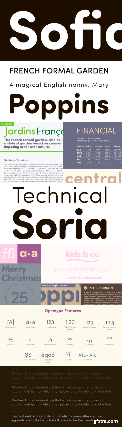
Sofia Soft is the rounded version of the successful Sofia Pro family. This softer variation with rounded strokes gives Sofia Soft a unique geometric sans friendly aspect for display uses, texts and headlines, branding, signage, print and web design projects. Sofia Soft is the ideal companion of Sofia Pro and improve versatility of the global font family with optimized spacing and kerning for print and display. Sofia Soft supports extensive languages such as Western European, Central and Eastern European languages. Available in 8 versatile styles, all weights contain the same Opentype features than his sister with case sensitive forms, stylistic alternates, localized forms, standard ligatures, lining and oldstyle figures.
TTF | 8 Fonts | JPEG Preview | 4.6 Mb RAR
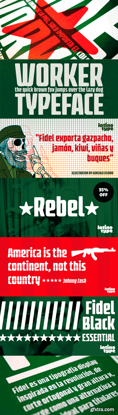
Fidel Black Essential is a heavily weighted, condensed, sans-serif typeface with a large x-height. Ideal for short, high-impact headlines, its design is inspired by Russian Constructivism and old Cuban communist posters. Variants include Fidel Black, Fidel Black Italic and Fidel Black Stencil. Fidel Black Essential is an excellent choice for headlines, subheadings, posters and logotypes. Languages: Basic Latin, Euro, Mac OS Roman.
OTF | 3 Fonts | JPEG Preview | 4.2 Mb RAR
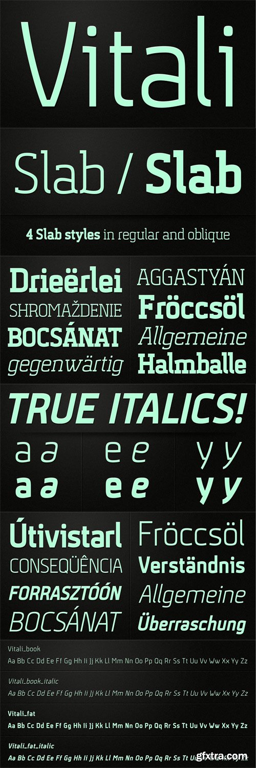
Vitali is a variation of my last font Aneba_family. This is geometric sans serif typeface family with a clean feel. The low contrast and high x height is perfect for longer text and Headlines. Vitali family contains 2 weights in two different styles - bold & italic.
OTF | 8 Fonts | JPEG Preview | 6 Mb RAR
The design of Beau Sans was inspired by Bernhard Gothic which is considered one of the first contemporary American sans serifs and was designed by Lucian Bernhard in the late 1920s. Panos Vassiliou came across this font while attempting to reduce the design elements of a text typeface, by introducing Bauhaus-like minimal forms to the characters. The first version was completed back in 2002 and introduced one year later in Parachute’s 3rd catalog, under the name PF Traffic. Some time later it was decided to make a few improvements but the project was so carried away that the new typeface which emerged needed urgently a new name. Beau Sans Pro is a modern sans-serif family of 16 fonts which includes true-italics. Just like all other Parachute fonts, it covers a broad range of languages by incorporating 3 major scripts i.e. Latin, Greek and Cyrillic in one font. Furthermore, every font in this family has been completed with 270 copyright-free symbols, some of which have been proposed by several international organizations for packaging, public areas, environment, transportation, computers, fabric care and urban life. This typeface is totally recommended for titles and/or body text when you want to give a distinct and contemporary identity to a product or service.
OTF | 16 Fonts | JPEG Preview | 7.8 Mb RAR
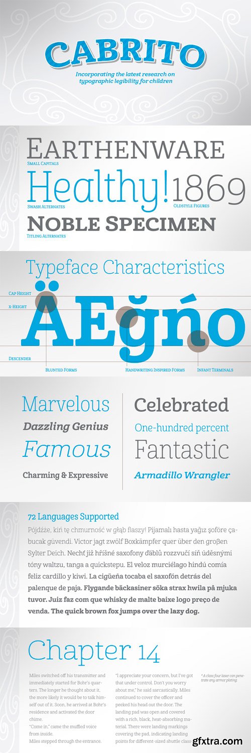
This new serif typeface incorporates the latest research on typographic legibility for children, features to make it--well, extra legible. A little background: studies show that Bookman Old Style is one of the most readable typefaces, and as a consequence or perhaps the reason why, it is used thoroughly for childrenís books. This font became my initial inspiration for the typeface. Then, I found more legibility research saying that (brace yourselves) Comic Sans is also very legible for beginning readers, much due to the large x-height and softer, easily recognizable forms. In addition, forms that are closer to handwriting also seem to be more legible. Once I threw all that into my cauldron and stewed it a bit, the result was a pleasantly rounded typeface that includes not-so-strictly geometric, handwriting-inspired forms for the b, d, p, and q. Es guapo! Cabrito’s slender weights are simple and fun, with extras that turn any “bah humbug” into a smile. Add lighter touches to your project with the typeface’s included sparkles or rainbows (not included). Splash a little more color on the page with the firmer look of the thicker weights. Cabrito’s upright variations across all weights are matched by optically altered italics, too, giving you even more variety with the font family. This modern typeface’s bundle of alternates can be accessed in any OpenType-enabled software. The fashionable options involve a significant team of alternates, swashes, and meticulously refined aspects with ball terminals and alternate titling caps to decorate the font. Also bundled are swash alternates, old style figures, and small caps. Peruse the PDF brochure to check out these options in motion. OpenType-enabled applications like the Adobe suite or Quark allows comprehensive control of ligatures and alternates. This font family also provides the glyphs to aid a variety of languages. Cabrito is a welcoming, everyday font family by Jeremy Dooley. Use it to convey warmth and friendliness on anything from candy and food packages to childrenís toys, company IDs or run-of-the-mill promotional material. Cabrito’s unique appearance and high legibility make it equally at home in print as it is on a screen.
OTF | 48 Fonts | JPEG Preview | 8.2 Mb RAR
SermonBox - Seasonal Collection

SermonBox - The Series Pack Collection

Top Rated News


Would you like to be a Author?